Well, the sun was out yesterday and I got around to swatching them and I think I've changed my mind!
In the bottles they do look pretty ugly. Bland, boring, would never catch my eye on a shelf among other more interesting polish collections.
However, on the nails they're actually really cool. They're a frosty metallic texture. Not really chrome or reflective, but a smooth shimmery type of metallic. Sort of futuristic looking. Not all of the colors are 'my thing', but there are a few that I'm seriously digging.
These are sold in two halves like past China Glaze collections, a warm selection and a cool selection. I don't remember which are which, so I'll present them alphabetically.
As always, please click on the pictures to view them full size- I try to leave them really big so you can see the detail of the polish :)

Admire. See? Isn't it cool? Admire is a cool silvery pinkish color. For once, a pink that is flattering on me!

Adore. I don't know what color this is. I want to say blue, but it seems more... teal? Is it turquoise? I say it's blue. This is one of my favorites. Spaceman blue. (... Cause you're the one that I adore... We must never be apart....We must never be apart... )

Awaken. Awaken, take the land that must be taken! Okay, sorry, had to do it. Ten points to anyone who gets the joke :) Aaaaanyway, it's a gorgeous blued-charcoal metallic. Looks really similar to some of China Glaze's other charcoal metallics, but the texture of this one is superior. Smooth and opaque, very lovely.

Cherish. A frosty mint green. This one was disappointing to me. How many light mint greens do we need, honestly? I can think of four other polishes I have that look like this. Nail polish companies: stop making light greens. We want rich, deep, saturated forest greens!!! Cherish the thought of always having you here by my side...

Delight. Kind of a bronzy brown with a reddish mauve tint to it. This is one of the ones I thought looked really ugly in the bottle, but once I put it on my nails I decided that I liked it. (Uhh... sky rockets in flight??)

Devotion. Sweet devotion, it's not for me... Just give me motion and set me free.... Seriously, all of these names are reminding me of songs. Maybe they did that on purpose. Devotion is a gorgeous frosty silver. Right up my alley, I'll definitely be wearing this one.

Emotion. Sweeeeeet emotion.... Metallic medium warm-ish pink. Plain, but pretty. The color doesn't wow me but I like the finish. I would probably never wear this, but I'm sure it will be a popular color. But I need some time of from that emotion, time to pick my heart up off the floor...

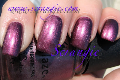
Harmony. Unforgettable harmony. Holy crap, did I just sing Barry Manilow lyrics?! I'm embarrassed for myself. *ahem* Harmony is a drop-dead gorgeous metallic purple. I really love this one. It's bright and shiny and PURPLE!!! .... together in perfect harmony...

Joy. Have I no control, is my soul not mine? Am I not just man, destiny defined? (That's one of my favorite songs ever. Anyone know it?) Joy is a really stunning muted purple metallic. This might be my favorite of the entire collection. Truly lovely. Joy to the world...

Magical. There's not too much magic in this one. It's a pretty yet bland pinkish silver. Kind of... champagne? It's not really gold, but it's too pink to call it pure silver. I can't think of a song lyric for this one.

Passion. Wow, I can't think of a song lyric for this one either! Totally gorgeous light gold metallic. Might be tied with Joy for my favorite. I would wear this all the time. It rocks.
(Ooh, I think I have a song. Amy Rose's theme in Sonic Adventure is called My Sweet Passion...)

Poetic. I'm not sure what to call this color, either. Light metallic dusty rose? Mauve? Pretty but again, not anything special. It doesn't wow me, but I still like it.
Overall, I do like this collection. As I said, my first impression of it was that it was really ugly and boring. It's not. The bottle color is very deceptive, because once you put these on your nail they're really fascinating. And the more I think about it, the more I appreciate China Glaze for doing different collections. I mean, look at some of the other collections that were released recently. Essie Winter, OPI La Collection de France and Holiday in Toyland, Lippmann and Rescue Beauty Lounge's recent collections... This collection is nothing like any of those. I'm not sure if it's because it's meant for a different season, but this is totally unique. Essie would have released red and pink cremes, OPI would have done maybe some interesting vampy shimmers, but China Glaze released pastel metallics. I like that.
The formula was pretty nice on these. It was still a little runny and goopy like three-free polishes tend to be, but these went on nice and smooth with minimal running or streaking and they were surprisingly opaque. The were a little quicker to dry than usual as well. I have no complaints.
The names are really hard to remember. It's like OPI's Designer Series with the one word names that aren't the least bit memorable or descriptive and they're all really similar. Design, Desire, Extravagance, Exclusive, Elegant... How am I supposed to mentally connect the name of the polish with the color? I need a cheat sheet or something.
I found it amusing that most of the names immediately made me think of songs. I suppose that the names are generic enough that the words are used in a variety of songs, and maybe they meant it that way. Maybe I'm just nutty.
So... what do you think? I say: Awesome finish, bland colors, but a very versatile and pretty collection.

No comments:
Post a Comment